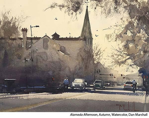
Click here to see this email on the web |  | Tuesday, October 5th, 2022 | | Stop Making These Common Mistakes | By Kelly Kane | Share this article:     | "Most students paint with way too much water and use too big of a soft brush for the entire painting," says Dan Marshall.
| 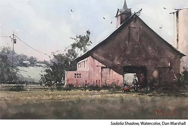 | Choose the Right Watercolor Brush for the Job
"It's important to use the right tool for the right job, abandoning your largest brush once you've finished the initial washes. I hold all the brushes I need in my left hand while I am working. Selecting these brushes at the start of the painting is one more step in thinking through the painting start to finish. As I move through the painting I disregard a brush when I am finished with it and by the end of the painting my left hand is empty." | 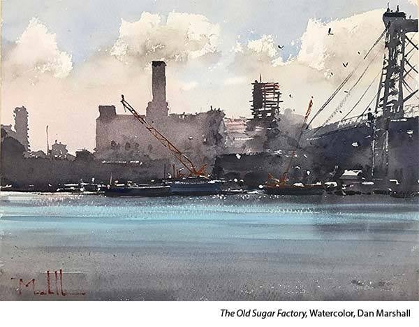 | — advertisement — |  | Use the Right Amount of Water
"The watercolor clock was developed by Joseph Zbukvic and is a method of determining pigment-to-water ratio (thin to thick) as well as identifying the moisture level of the paper (dry to wet). It is key to knowing what consistency of paint to use on what level of wetness of paper and when to use it for the desired effect. This is the key to giving your paintings a real sense of color (not weak paintings), full of tone, body, and a sense of gravitas. | 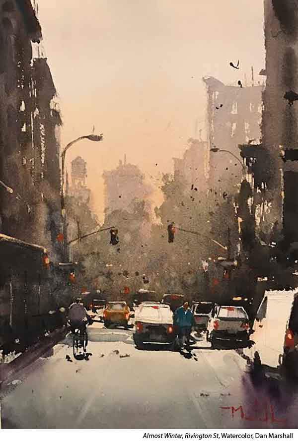 | "To keep your paintings from looking like a cut paper collage of tone and color, work while controlled areas of your painting are wet to create soft and lost edges that suggest subtle details or add atmospheric perspective. For example, you may work on the background while it's wet, but the foreground or middle ground is dry. Working in this manner keeps unity in the large shapes while still suggesting complexity and detail."
|  | Joseph Zbukvic Watercolor Clock
One side of the clock represents the paper and it is divided into four different degrees of wetness: dry, damp, moist and wet. | 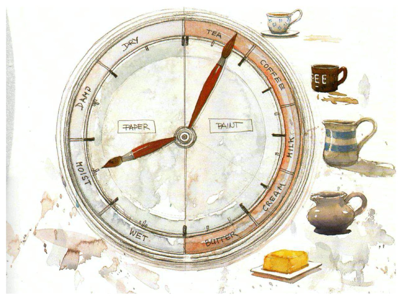 |
|
|
|
DRY PAPER
For hard edged shapes and for dry brushing. Drawing, scraping and make lines. The time to do sharp effects.
DAMP PAPER
For broken edges and shapes.
A good time to lift pigment and to scratch out.
MOIST PAPER
For soft, controlled edge shapes.
Best for misting effects, shaping and for blending.
WET PAPER
For soft, "lost" or uncontrolled edge shapes. The other side of the clock represents the palette with varying consistencies of watercolor mix: tea, coffee, milk, cream and butter.
TEA
Weak transparent colors are suitable for those gentle misty paintings.
• This is the lightest toned wash.
• Tea washes will run freely on a tilted palette.
COFFEE
Strong translucent colors are ideal for bright and happy paintings that are
full of light.
• This is the wash to use for quarter-tones. • Runs freely, but less than tea.
MILK
Creating a medium contrast against white paper, it's probably one of the most frequently used washes. Over larger areas it will form those wonderful granulating effects and rich, yet transparent, colors. It can be dry brushed effectively.
• Use this consistency wash for half-tones. • It will move slowly on tilted palette.
CREAM
Fantastic for the strongest color notes in powerful, rich paintings.
• Thick pigment for three-quarter tones.
• Will move only a bit, if at all, on a tilted palette.
• Cream wash will not bead.
BUTTER
Butter consistency pigment is good for solid color in small doses, such as stop-lights and small figures. It should be reserved for the very darkest darks when finishing your painting with those last magic touches.
• Full tone pigment —no water.
• This will stick to the palette like glue. | — advertisement — |  | Challenging Stereotypes | By Kelly Kane | 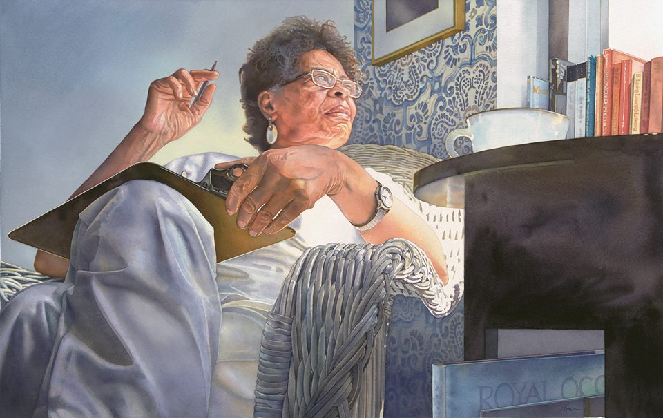 | "Carol" (watercolor) | "Carol is a transparent watercolor from 'Second Wind,' a series of narrative, figurative portraits that challenge stereotypical views of aging," says Irena Roman. "This body of work focuses on the vitality and creativity of individuals who have discovered a new, post-retirement vocation; their active, passionate engagement with creative pursuits developed after the age of sixty-five.
"At best, our youth-obsessed culture turns a blind eye to seniors, but by the year 2050, twenty percent of the U.S. population will be ages 65 and older. Now, more than ever, positive metaphors about aging are necessary! My goal with this series is to exemplify the grace and wisdom of those who possess a wealth of knowledge that can only be obtained through a lifetime of experience.
"After retiring from an exciting career as an actress and piano instructor, Carol Carter decided to take a writing class, which motivated her to write, illustrate, self-publish and market her own book, loosely based on her life adventures. A charming, vivacious, and down-to-earth woman, I chose to depict her from a low, dramatic vantage point in order that the viewer might feel as though they're sitting at her feet listening to her weave a fascinating story. Ultimately, what I'm interested in is uncovering the intangible, ethereal nature of my subject matter and striving to preserve that fleeting illusion of presence. Carol is a bonafide role model. I've learned so much from her and feel privileged to have been able to paint her."
| — advertisement — |  | | |
|
American Watercolor is committed to protecting and respecting your privacy. We do not rent or share your email address. By submitting your email address, you consent to Streamline Publishing delivering regular email issues and advertisements. To end your American Watercolor e-mail subscription and associated external offers, unsubscribe here. To learn more about Streamline Publishing events, products, and offerings visit StreamlinePublishing.com
Copyright 2022 Streamline Publishing, Inc. All rights reserved.
American Watercolor® is a registered trademark of Streamline Publishing, Inc. |
|
|
|
|


No comments:
Post a Comment