Ron Stocke demonstrates his process for creating watercolor paintings with impact.
Click here to see this email on the web |  | Thursday, November 10th, 2022 | | Pack a Punch With Darks and Details | By Kelly Kane | Share this article:     | Ron Stocke demonstrates his process for combining shapes and ending with a punch of darks.
| 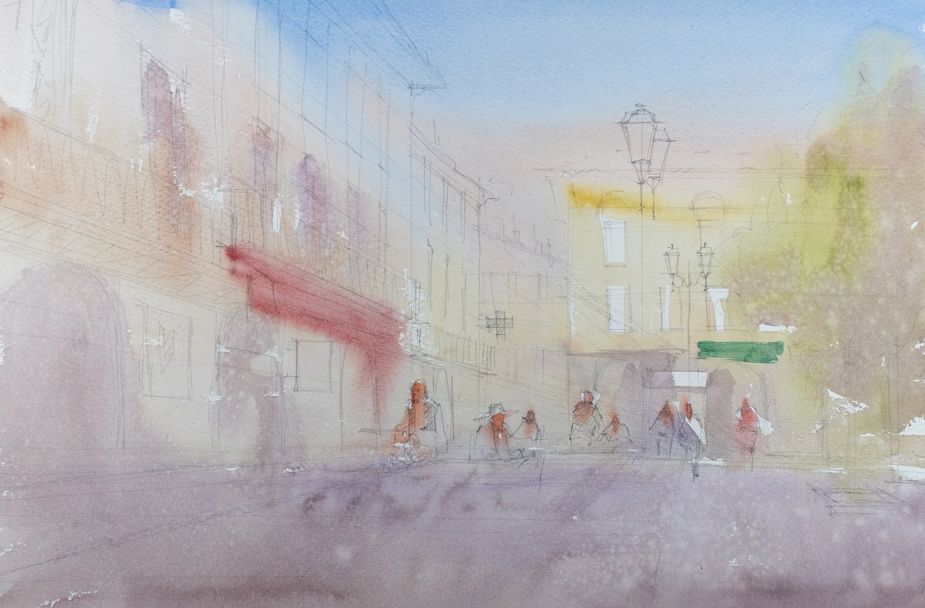 | Step 1 | Step 1
"I started with a wash of cobalt blue and added cadmium orange just before I laid in a second wash of yellow ochre for the distant buildings, and a mixture of burnt sienna and purple for the foreground," says Ron Stocke. "Some yellow ochre and a light wash of purple were scribbled into the tree on the right. The accent colors for the awnings and faces were applied just before this first wash dried completely." | 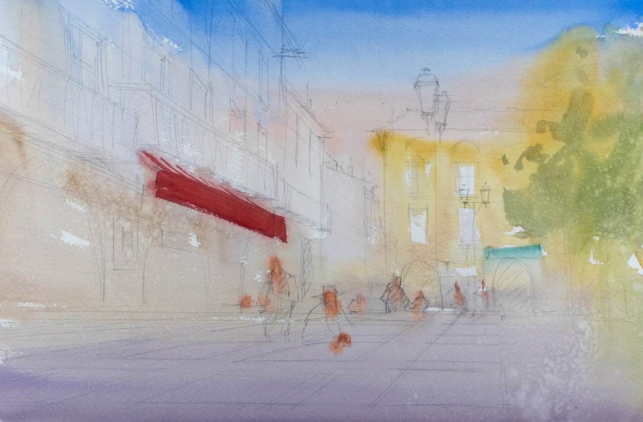 | Step 2 | Step 2
"I hit the awning on the main building with cadmium red and added sap green to the tree," he says. "I did this now, so that I could connect the shapes later."
| — advertisement — |  | 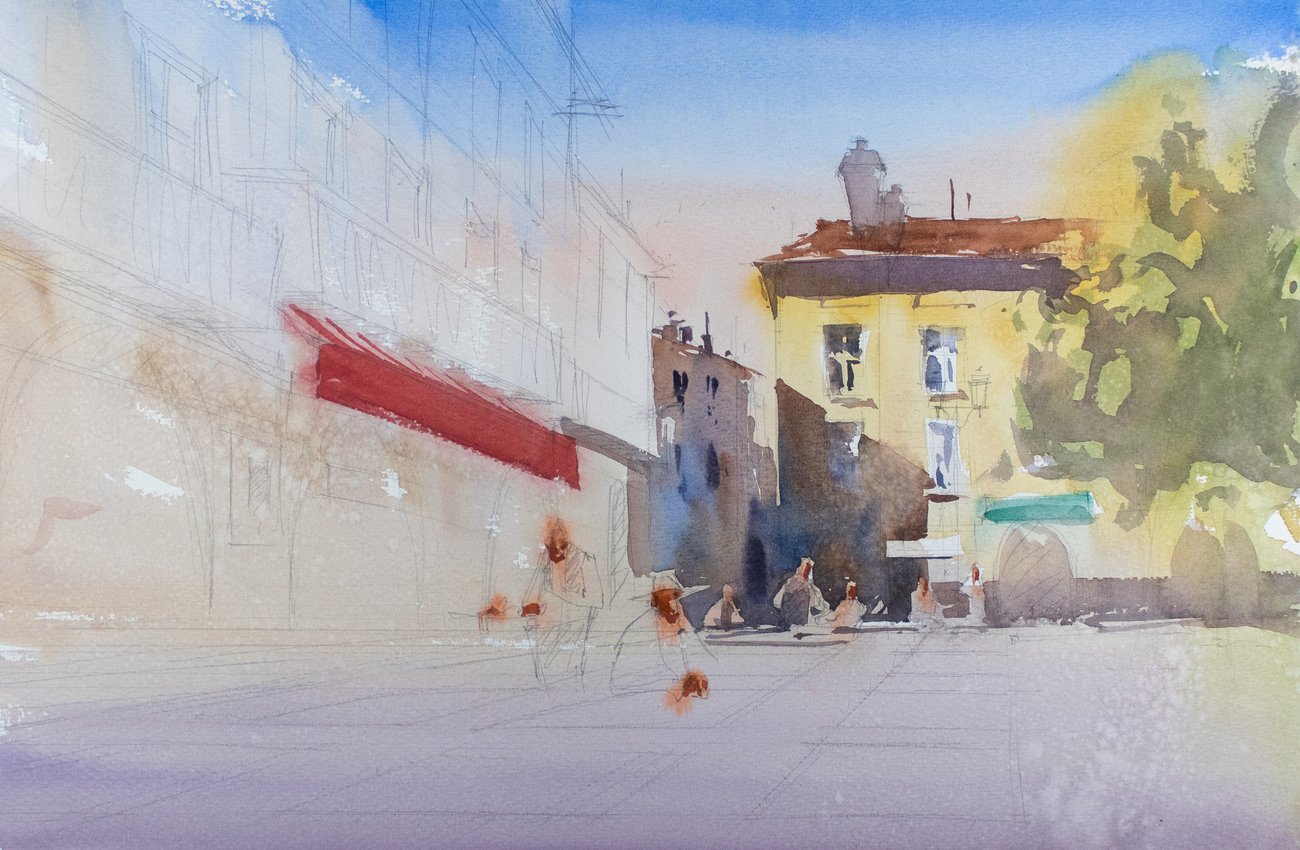 | Step 3 | Step 3
"Next, I started what would be the beginning of one large shadow that would cover almost two-thirds of the painting," says the artist. "I was careful to start grabbing figures, signs, and other objects that I wanted to be connected and not look cut out and pasted on. I also applied shadows on the distant building." | 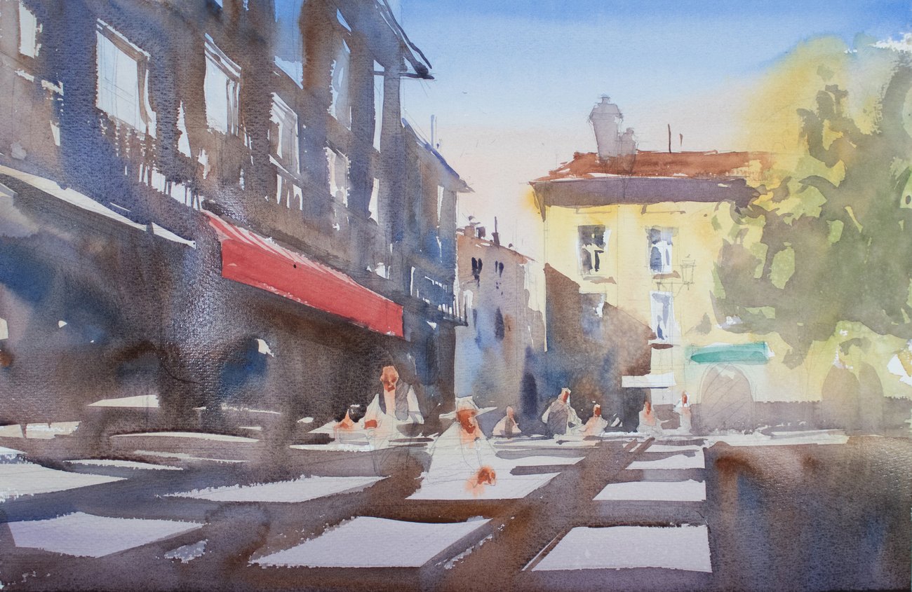 | Step 4 | Step 4
"I continued the shadow that I started at the furthest point of the painting all the way to the foreground, so that it now takes up most of the painting. To do so, I used a mixture of burnt sienna, ultramarine blue, and purple. I made sure to keep the shapes of the tables that are set out in rows in front of the quaint French café." | 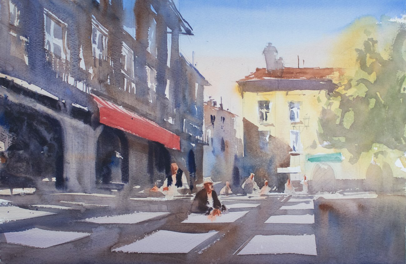 | Step 5 | Step 5
"With most of the painting done, I quickly suggested afew figures and some other details, like the arches, additional awnings, windows, and a shadow on the tree." |  | "Lunch in Limoux" (watercolor, 14 x 21 in.)
|
|
|
|
Final Step
"A finish with calligraphy competed the painting. Using a thick mixture of honey-based M. Graham's ultramarine blue and maroon, I was able to achieve my darkest darks — an element I see missing in most watercolors." | Learn how three contemporary masters capture the energy of the city in watercolor. | — advertisement — |  | Ambassador of the Week: Annisette Falk-Jensen | By Kelly Kane |  | "Lake Mirror" (watercolor painting) by Annisette Falk-Jensen | "I love contrasts," says Annisette Falk-Jensen. "When the light settles gently or cuts through a motif, it is the shadows that create this light. Likewise, a cold color is crucial to bring out a warm tone. It is the contrasts that challenge me, and without these contrasts I could not express myself artistically." | Join our community of ambassadors from all over the world and help spread the word about American Watercolor. Invite your friends to subscribe and if five sign up, you can enter your work for the opportunity to be featured to thousands of subscribers in an upcoming newsletter. | — advertisement — |  | | |
|
American Watercolor is committed to protecting and respecting your privacy. We do not rent or share your email address. By submitting your email address, you consent to Streamline Publishing delivering regular email issues and advertisements. To end your American Watercolor e-mail subscription and associated external offers, unsubscribe here. To learn more about Streamline Publishing events, products, and offerings visit StreamlinePublishing.com
Copyright 2022 Streamline Publishing, Inc. All rights reserved.
American Watercolor® is a registered trademark of Streamline Publishing, Inc. |
|
|
|
|


No comments:
Post a Comment