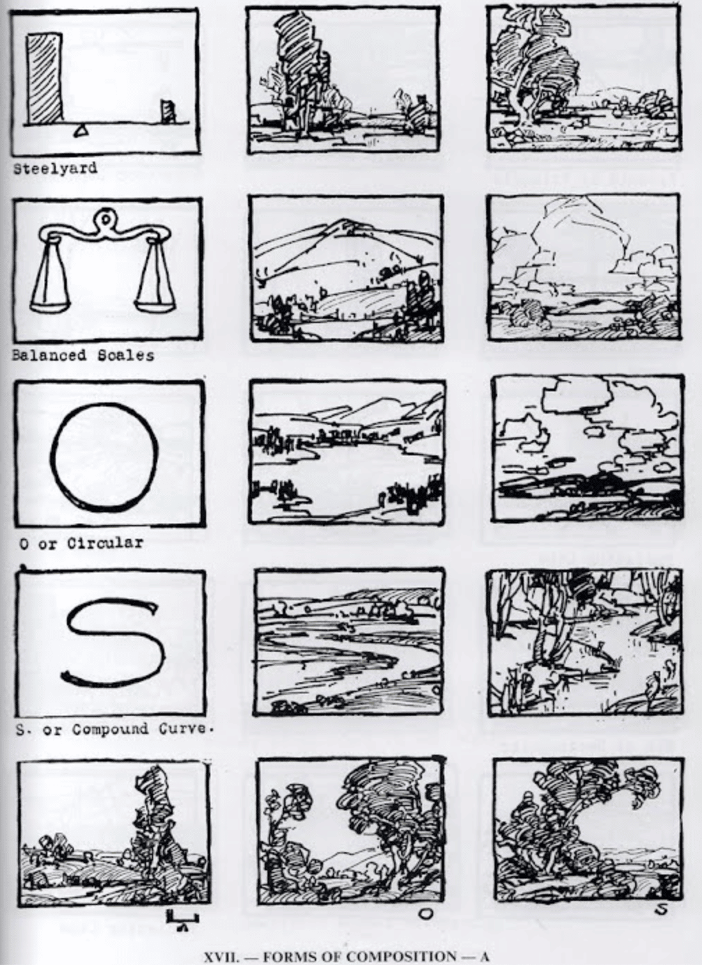
Click here to see this email on the web |  | Friday, December 2nd, 2022 | | Composition Demystified | By Christopher Volpe | Share this article:     |  | One of the best sources for learning composition, especially (but not exclusively) in landscape painting, is Edgar Payne's legendary book, Composition in Landscape Painting.
Payne breaks down landscape into about a dozen or so composition types with another two dozen variations on those, pretty much covering the field, so to speak. He gives a simplified thumbnail sketch of each composition's underlying geometry as well as several examples of how it might play out in a painting. |  | One of the most useful is the "Steelyard" strategy (shown at the top off the list) Named after an artist who popularized it, the Steelyard composition balances a larger, dominant mass against a smaller, or subdominant mass. Using it provides a surefire way to avoid lifeless symmetries and instead create "harmony in variety," the gold standard for all composition.
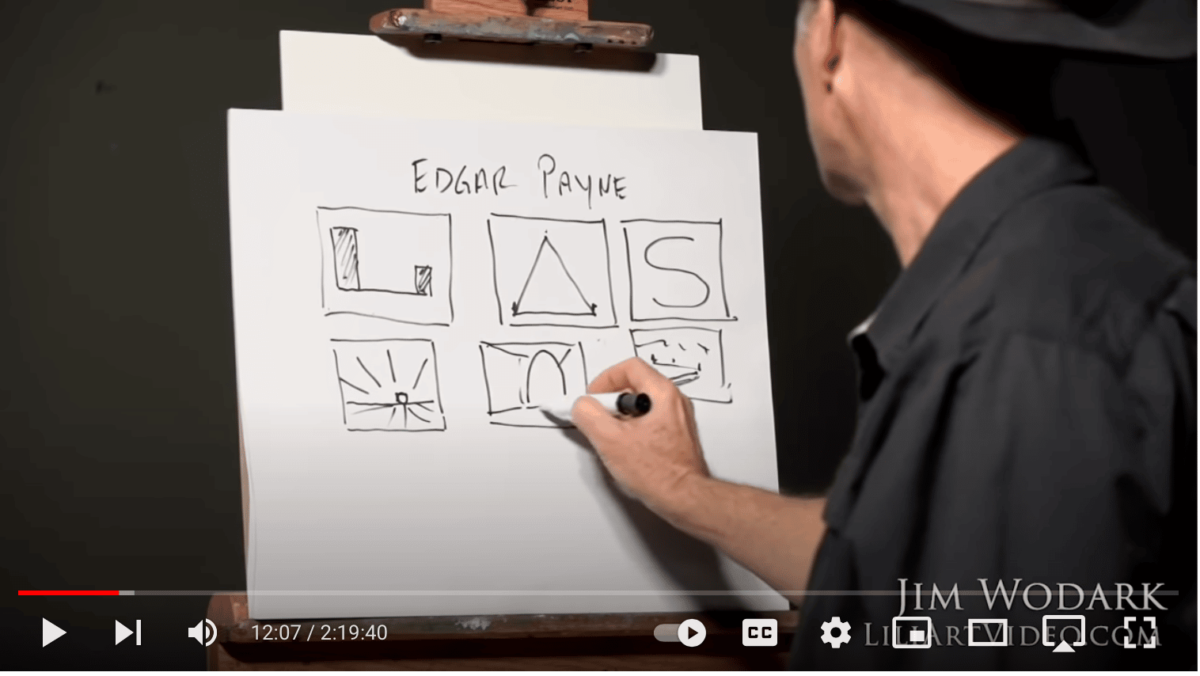
This Youtube video introduces and reviews Payne's invaluable composition diagrams.
| — advertisement — |  |  | Jim Wodark, Ancient Pine, oil, 20 x 24. | One major contemporary landscape painter who uses Payne's principles in his work and teaching is Jim Wodark. Wodark has a free two-hour video with a short demo and an interview watchable for free on Youtube in which he references the Payne diagrams.
He's also got a thorough, five-hour step-by-step teaching DVD titled Composition for Painters.
In the longer video, Wodark details how great composition leads to great paintings that help viewers to "read" an artwork's "story." |  | Jim Wodark, Harbor Sunrise, oil, 16 x 20. | It's the marriage of color and composition, Wodark says, that imparts feeling and emotion into works of art that consistently beguile collectors.
It's general knowledge but always worth remembering that any work of art lives or dies based on the strength or weakness of its underlying abstract design. Those structural underpinnings begin to reveal themselves once you learn to see past the surface of any painting, which requires disregarding the bells and whistles of all the other techniques that we find so dazzling and bewitching. |  | Grab a copy of this high-res scan of Edgar Payne's key composition types by saving it to your phone or dragging it to your desktop.
What's more, for artists who don't go to an "art school," composition often presents difficulties because it's the least intuitive of all the aspects of painting. In some ways, good composition actually runs against our natural tendencies. Human begins have a certain bias toward symmetry, perhaps a side-effect of how our senses create order from chaos.
It's natural to draw things "smack in the middle," in a neat line, all with similar shapes and sizes, equal visual weight and symmetry. You have to train yourself not to draw or paint that way; the principles underlying perception and art may be related but they are far from "the same." Good composition requires learning and practice.
The best way to approach it is to learn to see paintings not as "pictures of things" at all but as carefully constructed arrangements of shapes and colors, and in that order. |  | Jim Wodark, Red Bluff Trail, oil, 16 x 20. | Look at what the big shapes are doing first. Shapes means angles, proportions, lines and masses at varying levels of complexity. But as Payne and Wodark demonstrate, it's the ability to break down complexity into simple shapes, the BIG SHAPES, and from there to create compelling (not intuitive) arrangements of them, that makes the difference.
Check out Wodark's teaching DVD titled Composition for Painters here. |
|
|
|
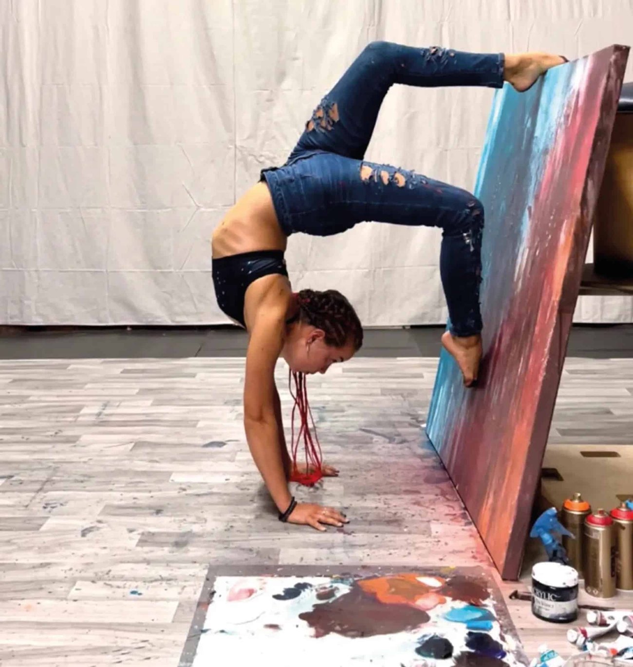
— advertisement — |  | "Try Turning It Upside Down" |  | Brianna Fitzpatrick demonstrates her painting style. Courtesy of Spectrum
During this year's Miami Art Week, multi-talented gymnast and martial arts expert Briana Fitzpatrick is "putting brush to canvas while in mid-air," according to a story in The Art Newspaper, and creating paintings in contorted poses.
"I was watching an online tutorial of how to paint portraits and the instructor said [that] if you struggle with seeing proportions correctly, then flip the painting upside down, and I thought to myself, 'huh, why don't I just flip myself upside down instead?'" she explains. Fitzpatrick will be doing demonstrations at the Spectrum Miami fair 1-4 December, 2022. But if you miss it, don't worry. I hear she has a flexible schedule.
|
|
| | |
|
Inside Art is committed to protecting and respecting your privacy. We do not rent or share your email address. By submitting your email address, you consent to Streamline Publishing delivering regular email issues and advertisements. To end your Inside Art e-mail subscription and associated external offers, unsubscribe here. To learn more about Streamline Publishing events, products, and offerings visit StreamlinePublishing.com
Copyright 2022 Streamline Publishing, Inc. All rights reserved.
Inside Art® is a registered trademark of Streamline Publishing, Inc. |
|
|
|
|


No comments:
Post a Comment